Siddhant Deval
Siddhant DevalAuthor
Senior Full-Stack Engineer·Oct 20, 2026·12 min read

Styling Isolation and Design System Distribution

Style isolation is not a CSS problem — it is a boundary-enforcement problem. The correct isolation mechanism is determined by your composition strategy, not your preferred CSS methodology. This article ranks every approach by isolation strength and tells you when each is the right call.

Styling Isolation and Design System Distribution

A micro-frontend is not a smaller app — it is a domain boundary enforced at the deployment layer. If you can't explain the business capability it owns, you haven't drawn the boundary yet.
In a monolith, style isolation is managed by convention: agree on a naming system, enforce it in code review, and the worst outcome is a specificity war. In a micro-frontend system, the stakes are higher. The Checkout team ships a CSS reset in their remote. The Catalog team's product cards suddenly have no margins. Nobody added a bug — two independently correct stylesheets composed into an incorrect result. This failure mode does not appear in any remote's own CI pipeline. It only manifests in the composed environment.
Style isolation is not a CSS problem. It is a boundary-enforcement problem. The correct isolation mechanism is determined by how your remotes are composed — not by which CSS methodology your team prefers.

1. CSS Bleed Anatomy

1.1 How Styles Leak at Runtime Composition Boundaries

When two independently built applications are composed in the browser, their stylesheets are concatenated in the document. CSS operates on the global document scope — there is no native namespacing unless you explicitly create one.
html
<!-- What the browser sees after the shell loads all remotes -->
<head>
  <!-- Shell styles -->
  <link rel="stylesheet" href="/shell/main.css" />

  <!-- Checkout remote styles — loaded dynamically when /checkout is visited -->
  <style id="checkout-styles">
    /* CSS reset — zero-specificity global styles */
    *, *::before, *::after { box-sizing: border-box; }
    body { margin: 0; font-family: 'Inter', sans-serif; }
    a { text-decoration: none; color: inherit; }   /* ← affects ALL links in document */
  </style>

  <!-- Catalog remote styles — loaded when /catalog is visited -->
  <style id="catalog-styles">
    .card { margin: 16px; }
    /* ← "card" class collides with shell's .card — last wins */
  </style>
</head>
Three categories of style bleed:
Global resets — A * { box-sizing: border-box } or body { margin: 0 } in a remote's stylesheet applies to the entire document, not just the remote's rendered subtree. If the shell was not expecting this reset, layout shifts appear.
Class name collisions — Both the shell and a remote have a .button or .card class. When both stylesheets are active, the later-loaded one wins — with no error and no warning.
Specificity wars — A remote's .checkout .button:hover selector bleeds into the shell's navigation buttons because the shell also has a .button class.

2. CSS Isolation Mechanisms Ranked

The correct isolation mechanism depends on your remote's composition strategy:
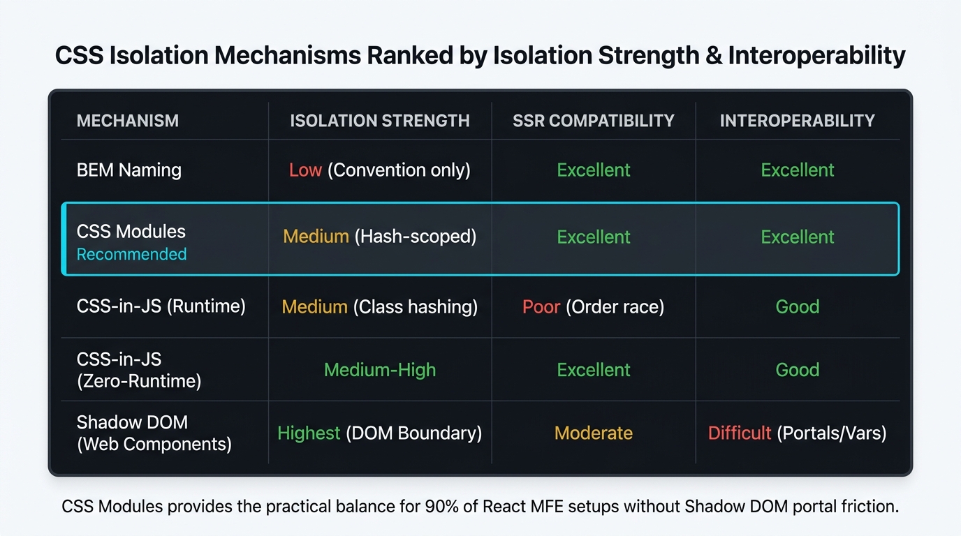
Comparison matrix showing CSS isolation mechanisms for micro-frontends ranked across four axes. Five rows for each mechanism: BEM Naming, CSS Modules, CSS-in-JS (Runtime), CSS-in-JS (Zero-Runtime), Shadow DOM. Four columns: Isolation Strength, SSR Compatibility, Interoperability, Implementation Cost. BEM: Low/Low isolation (red), Good SSR (green), Good interop (green), Low cost (green). CSS Modules: Medium isolation (amber) — hash-based classnames, Good SSR (green), Good interop (green), Low cost (green). CSS-in-JS Runtime: Medium isolation (amber), Poor SSR (red) — style injection order non-deterministic, Good interop (green), Medium cost (amber). CSS-in-JS Zero-Runtime (Linaria, vanilla-extract): Medium-High isolation (amber), Good SSR (green), Good interop (green), Medium cost (amber). Shadow DOM: Highest isolation (green), Good SSR with Declarative Shadow DOM (amber), Poor interop (red) — CSS vars must be explicit, High cost (red). A 'Recommended for most MFE teams' badge highlights CSS Modules row. Caption: 'Isolation strength and interoperability trade off inversely — Shadow DOM provides the strongest isolation but requires explicit CSS custom property threading for design tokens.'
Isolation strength and interoperability trade off inversely — Shadow DOM provides the strongest isolation but requires explicit CSS custom property threading for design tokens.

2.1 BEM Naming Conventions

BEM (Block Element Modifier) scopes styles by prefixing classnames with the component name:
css
/* checkout/src/components/Cart/Cart.module.css */
/* BEM: .checkout-cart__item-price--discounted */
.checkout-cart { padding: 24px; }
.checkout-cart__item { display: flex; gap: 12px; }
.checkout-cart__item-price--discounted { color: #dc2626; }
BEM provides zero technical isolation — it is purely a naming convention enforced by discipline. A developer can still write .checkout-cart a { color: red } and affect all links in the document. BEM is the correct baseline for teams sharing a codebase; it is insufficient for micro-frontends with independent build pipelines.

2.2 CSS Modules

CSS Modules transform class names into unique hashes at build time. Two remotes can both define .button — the build output gives them different names:
tsx
// checkout/src/components/Cart.tsx
import styles from './Cart.module.css'
// styles.button → "Cart_button__xK2mP" (checkout's build)

// catalog/src/components/ProductCard.tsx
import styles from './ProductCard.module.css'
// styles.button → "ProductCard_button__3nR9Q" (catalog's build)
css
/* checkout/src/components/Cart.module.css */
.button {
  background: #2563eb;
  padding: 12px 24px;
  border-radius: 6px;
}
/* Compiles to: .Cart_button__xK2mP { ... } */
CSS Modules are the recommended baseline for most MFE teams: low implementation cost, good SSR compatibility, and effective isolation for component-scoped styles.
Performance / Safety Warning
CSS Modules hash component-level classnames, but they do not prevent global style leaks from @import statements, CSS resets, font declarations, or any style not written inside a .module.css file. Scope all resets and global font declarations to the shell or to a design tokens package — never inside a remote's component stylesheet.

2.3 CSS-in-JS

CSS-in-JS libraries (Styled Components, Emotion) generate classnames at runtime and inject styles into <style> tags in the document head. They provide the same isolation level as CSS Modules for component-scoped styles, with two MFE-specific concerns:
Style injection order is non-deterministic in SSR — When two remotes using CSS-in-JS are server-side rendered and their HTML fragments are composed, the order of their <style> injection is determined by the composition order, not the component order. Specificity calculations can produce different results in SSR vs. CSR.
typescript
// ❌ Problematic in server-side composed MFE systems
// Emotion's insertionPoint config is required for deterministic order in SSR
import { CacheProvider } from '@emotion/react'
import createCache from '@emotion/cache'

// Each remote must use a unique nonce and insertion point
const emotionCache = createCache({
  key: 'checkout',  // namespace prefix for all generated classnames
  // Without nonce: style injection order depends on hydration order
})
For zero-runtime CSS-in-JS (Linaria, vanilla-extract), styles are extracted at build time as CSS files — eliminating the runtime injection problem at the cost of losing some dynamic styling capability.

2.4 Shadow DOM

Shadow DOM creates a true style boundary at the DOM level. Styles inside a shadow root do not affect the document, and document styles do not penetrate the shadow root:
typescript
// A Web Component with Shadow DOM — maximum isolation
class CheckoutCart extends HTMLElement {
  constructor() {
    super()
    // attachShadow creates a style boundary
    const shadow = this.attachShadow({ mode: 'open' })
    shadow.innerHTML = `
      <style>
        /* These styles are completely isolated — cannot affect document */
        :host { display: block; padding: 24px; }
        .button { background: #2563eb; }  /* Cannot conflict with document .button */
      </style>
      <div class="cart-container"></div>
    `
  }
}
The isolation trade-off: Shadow DOM blocks all CSS inheritance, including CSS custom properties — unless they are explicitly defined as passthrough:
css
/* CSS custom properties DO cross Shadow DOM boundaries — by design */
/* Design tokens work correctly with Shadow DOM */
:root {
  --color-primary: #2563eb;
  --spacing-md: 16px;
  --font-body: 'Inter', sans-serif;
}

/* Inside shadow root — can read custom properties from the document */
:host {
  color: var(--color-primary);    /* ✅ works — custom properties cross the boundary */
  padding: var(--spacing-md);     /* ✅ works */
  font-family: var(--font-body);  /* ✅ works */
}

/* Portal rendering does NOT work in Shadow DOM — Radix UI dialogs, tooltips */
/* need the document body as the mount point, which breaks isolation */
Architectural Note
Shadow DOM's isolation cost becomes apparent when using component libraries that rely on portal rendering (Radix UI, Headless UI, Floating UI). Portals render into document.body, outside the shadow root — where shadow root styles do not apply. If your remote uses portal-based components extensively, Shadow DOM isolation forces manual style threading for every portaled element.

3. Design System Distribution

3.1 The Two-Layer Model

The design system in an MFE architecture has two distinct layers with different sharing strategies:
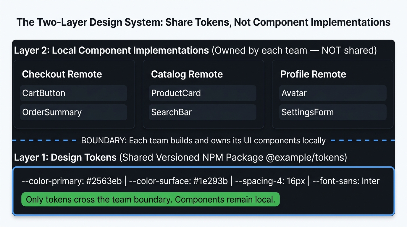
Mental model diagram showing the two-layer design system architecture. Top section labeled 'Layer 2: Component Implementations' divided into three columns: 'Checkout Remote Components', 'Catalog Remote Components', 'Profile Remote Components'. Each column shows component boxes (Cart UI, ProductCard UI, ProfileForm UI). Each column's components are labeled 'owned by each team — NOT shared'. Middle dividing line labeled 'Boundary: teams own their component implementations'. Bottom section labeled 'Layer 1: Design Tokens (Shared NPM Package)'. Single box spanning full width containing: '--color-primary: #2563eb', '--color-surface: #1e293b', '--spacing-md: 16px', '--font-body: Inter'. Label: '@example/design-tokens — versioned NPM package — changes are backward-compatible'. Right annotation: 'Only tokens cross the team boundary. Components do not.' Caption: 'Design tokens are the only shared visual layer — component implementations remain local to each team, preventing visual consistency from becoming a deployment coupling.'
Design tokens are the only shared visual layer — component implementations remain local to each team, preventing visual consistency from becoming a deployment coupling.
Layer 1: Design Tokens — The shared visual language: color palette, spacing scale, typography scale, border radii, shadow levels. Published as a versioned NPM package. Token additions are non-breaking. Token renames or value changes are breaking and require a major version bump.
css
/* @example/design-tokens/tokens.css — shared NPM package */
:root {
  /* Color */
  --color-primary-500: #2563eb;
  --color-primary-600: #1d4ed8;
  --color-surface-0:   #ffffff;
  --color-surface-50:  #f8fafc;
  --color-text-primary: #0f172a;
  --color-text-secondary: #64748b;

  /* Spacing (4px base unit) */
  --spacing-1:  4px;
  --spacing-2:  8px;
  --spacing-3:  12px;
  --spacing-4:  16px;
  --spacing-6:  24px;
  --spacing-8:  32px;

  /* Typography */
  --font-sans: 'Inter', system-ui, sans-serif;
  --font-mono: 'JetBrains Mono', monospace;
  --text-sm: 0.875rem;
  --text-base: 1rem;
  --text-lg: 1.125rem;
}
Layer 2: Component Implementations — Buttons, Cards, Inputs, Modals. These are implemented locally by each remote using the shared tokens. They are not shared — the Checkout team builds its own Button component using --color-primary-500. The Catalog team builds its own Button component. They look the same because they use the same tokens.

3.2 Why Component Implementations Are Not Shared

The temptation is to build one Button component and share it across all remotes. The problem: a shared component is a shared deployment dependency.
Scenario: Design System team releases Button v2.0 with breaking prop changes.

Without sharing (tokens only):
  → Each remote upgrades Button on its own schedule
  → No coordinated release required
  → Checkout upgrades this sprint; Catalog upgrades next sprint

With sharing (singleton component remote):
  → All remotes use the same Button version simultaneously
  → Design System team must coordinate the upgrade with every team
  → Release window required: every team must test the new Button before it ships
  → This is the deployment coupling problem from Part 1 — recreated in the design system
The only exception: when you have ≥5 remotes and visual consistency is a hard product requirement, the coupling cost of a singleton component library becomes worth accepting. Apply the decision matrix from Part 3 to this question — and document the trade-off explicitly.

3.3 CSS Modules in a Module Federation Context

When using CSS Modules inside a remote that is loaded via Module Federation, one configuration is required to prevent hash collisions:
javascript
// checkout/rspack.config.js — ensure unique CSS hash namespace
module.exports = {
  module: {
    rules: [
      {
        test: /\.module\.css$/,
        use: [
          'style-loader',
          {
            loader: 'css-loader',
            options: {
              modules: {
                // Prefix hash with remote name — prevents collision with other remotes
                localIdentName: '[name]__[local]__[hash:base64:5]',
                // In dev: 'Cart__button__xK2mP'
                // In prod: 'ax2mP' (shorter, still unique per remote due to different source paths)
              },
            },
          },
        ],
      },
    ],
  },
}
Without the unique prefix, two remotes that happen to have a component named Button.module.css with a .button class will produce identical hashes in production (same source file name + same class name). The second-loaded remote's styles win.

Summary

MechanismIsolation StrengthWhen to Use
BEM namingLow (convention only)Shared codebase; insufficient for independent build pipelines
CSS ModulesMedium (component scope)Recommended baseline for most MFE teams
CSS-in-JS runtimeMediumCSR-only apps; avoid in SSR-composed systems
CSS-in-JS zero-runtimeMedium-HighSSR-compatible alternative to runtime CSS-in-JS
Shadow DOMHigh (document isolation)Web Component remotes; avoid with portal-heavy component libraries
Design tokensShared layer onlyThe only thing that should cross the team boundary
Component implementationsNot sharedEach team owns its own components using shared tokens

What's Next

In Part 9 — the final article — we operationalize everything: independent CI/CD pipelines that cannot block each other, manifest-driven CDN deployments with 30-second rollbacks, distributed error attribution that tells you exactly which remote version caused a production incident. Part 9 → CI/CD, Independent Deployments, and Observability

References

  1. CSS Modules — Specification
  2. Emotion — Server Side Rendering
  3. vanilla-extract — Zero-Runtime CSS
  4. MDN — Using Shadow DOM
  5. MDN — CSS custom properties (variables)
  6. Style Dictionary — Design Tokens
Research & Synthesis Note

This article was developed with AI-assisted deep search, specification cross-referencing, and technical research synthesis.

#Micro-Frontends#CSS Modules#Shadow DOM#Design System#CSS-in-JS#Style Isolation
Siddhant Deval

Written by Siddhant Deval

Senior Full-Stack Engineer building high-scale architectures, browser performance engineering systems, and SaaS platforms.