Design System Architecture: Token Engines, Headless Primitives & the 3-Layer Model
A design system has exactly two independently evolvable layers — design tokens and headless primitives. This article builds the W3C DTCG token pipeline, explains why headless accessible components own logic but not visual presentation, and maps the 3-layer architecture that eliminates upgrade paralysis.
Frontend Platform & Scale Architecture
Design System Architecture: Token Engines, Headless Primitives & the 3-Layer Model
Architecture is not about drawing boxes on a whiteboard — it is about enforcing boundary contracts, deterministic caching, and secure data mediation across independent release units. Design systems fail not because they lack components, but because they fail to enforce the right boundaries between layers. When the layer that holds color values is bundled with the layer that holds button implementations, a brand refresh requires a major version bump, and twelve teams halt their work to test that their buttons still render.
This article establishes the architecture that eliminates upgrade paralysis: a strict three-layer separation between design tokens, headless accessible primitives, and composite domain components. The boundary between these layers is not a convention — it is a structural constraint enforced by your publishing strategy.
1. The Two Failure Modes of Design Systems
Most design systems fail in one of two ways. Understanding both is necessary before designing anything.
1.1 The Monolithic Library Trap
The monolithic design system ships as a single npm package: @company/design-system. It exports everything — color tokens, spacing values, Button, Input, Modal, DataTable, GlobalNavigation, CheckoutSummary. Every consuming app imports from one place.
This feels like convenience. It is a coupling bomb.
The root cause: tokens, primitives, and domain components are tightly coupled. They version together, they break together, and they require coordinated upgrades across every consuming team simultaneously.
1.2 The Unstyled Chaos Trap
The opposite failure: no shared design system at all. Each team builds their own buttons, their own modals, their own navigation. Every team reinvents the same accessibility patterns, every team makes different typographic decisions, and the product looks like five separate companies.
The correct architecture is neither. It is a structured separation of concerns across three independently versioned layers.
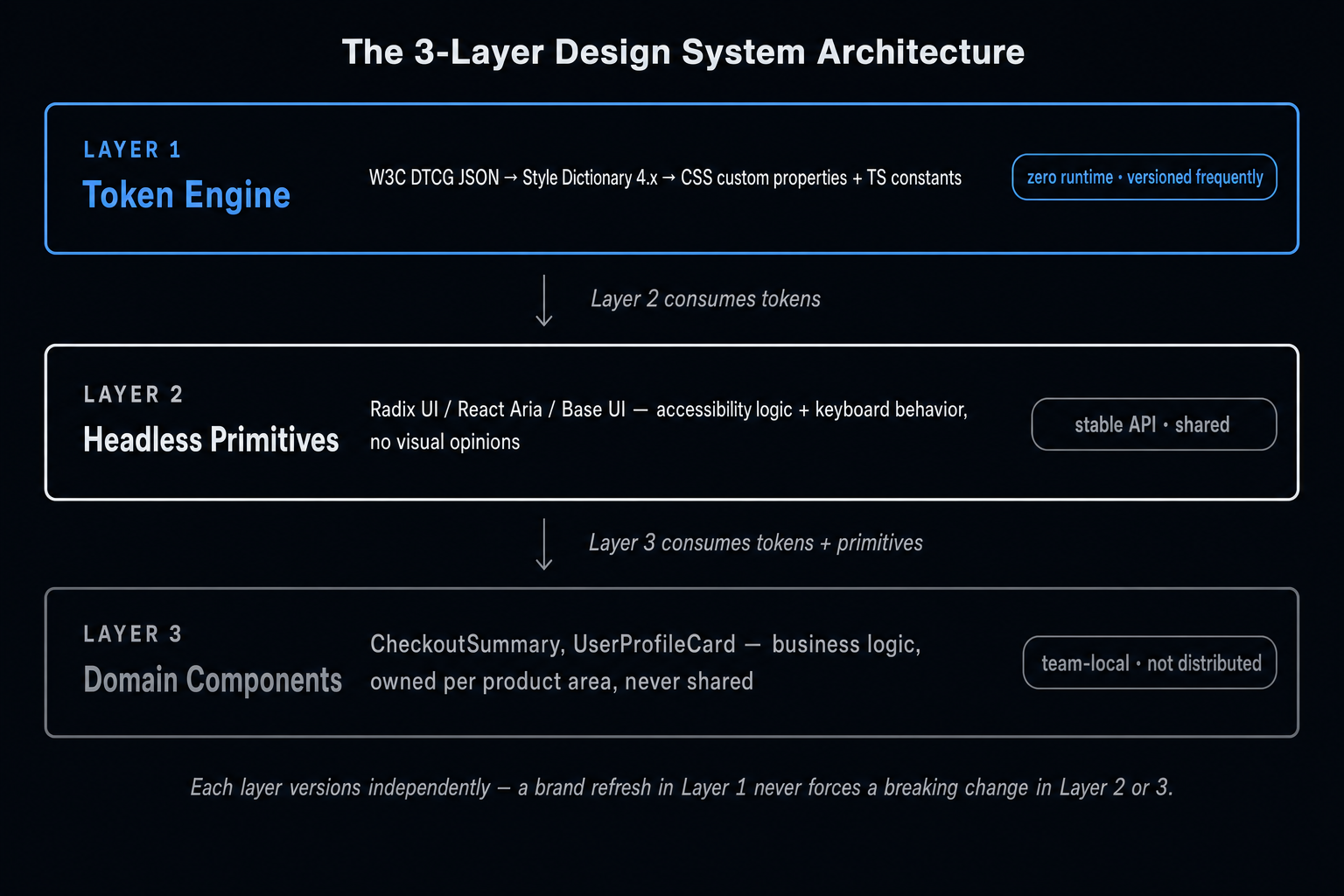
2. The 3-Layer Design System Model
Each layer has a different release cadence, a different owner, and a different distribution strategy. They are not sub-packages of one library — they are separate publishing units.
| Layer | Owner | Release Cadence | Distribution | Runtime Impact |
|---|---|---|---|---|
| 1 — Token Engine | Design Systems Team | High (brand updates) | Versioned NPM package | Zero (CSS variables, build-time constants) |
| 2 — Headless Primitives | Design Systems Team | Low (API-stable) | Versioned NPM package | Minimal (component logic only, no styles) |
| 3 — Domain Components | Product Team (per domain) | Independent | No sharing — owned locally | Contained (per-app bundle) |
3. Layer 1 — The W3C Design Tokens Community Group (DTCG) Specification
3.1 Why Ad-Hoc Token Schemas Create Migration Debt
For years, design teams used proprietary JSON schemas to define tokens:
Every tool (Style Dictionary, Token Studio, Theo, Chromatic) invented its own transformation pipeline for this format. The schemas are incompatible. Migrating between tools means rewriting every token file.
3.2 The DTCG Standard ($type, $value)
The W3C Design Tokens Community Group specification defines a portable interchange format now adopted by Style Dictionary 4.x, Token Studio, Figma Variables, and most major design toolchains:
DTCG types include: color, dimension, fontFamily, fontWeight, duration, cubicBezier, number, strokeStyle, border, typography, shadow, gradient, transition.
3.3 Token Aliasing and Semantic Tokens
Tokens can reference other tokens through aliasing — creating a two-tier system of primitive tokens (raw values) and semantic tokens (contextual meaning):
Semantic tokens decouple the meaning of a color (action.default) from its raw value (blue.500). A brand refresh that changes the primary blue from #0070f3 to #0062d1 requires updating one primitive token — all semantic tokens that reference it update automatically.
Always build two token tiers: primitive (exact values, named after what they are) and semantic (named after where they are used, aliasing primitives). Never allow consuming components to reference primitive tokens directly — only semantic tokens. This is what makes brand evolution non-breaking.
4. Layer 1 — The Style Dictionary 4.x Pipeline
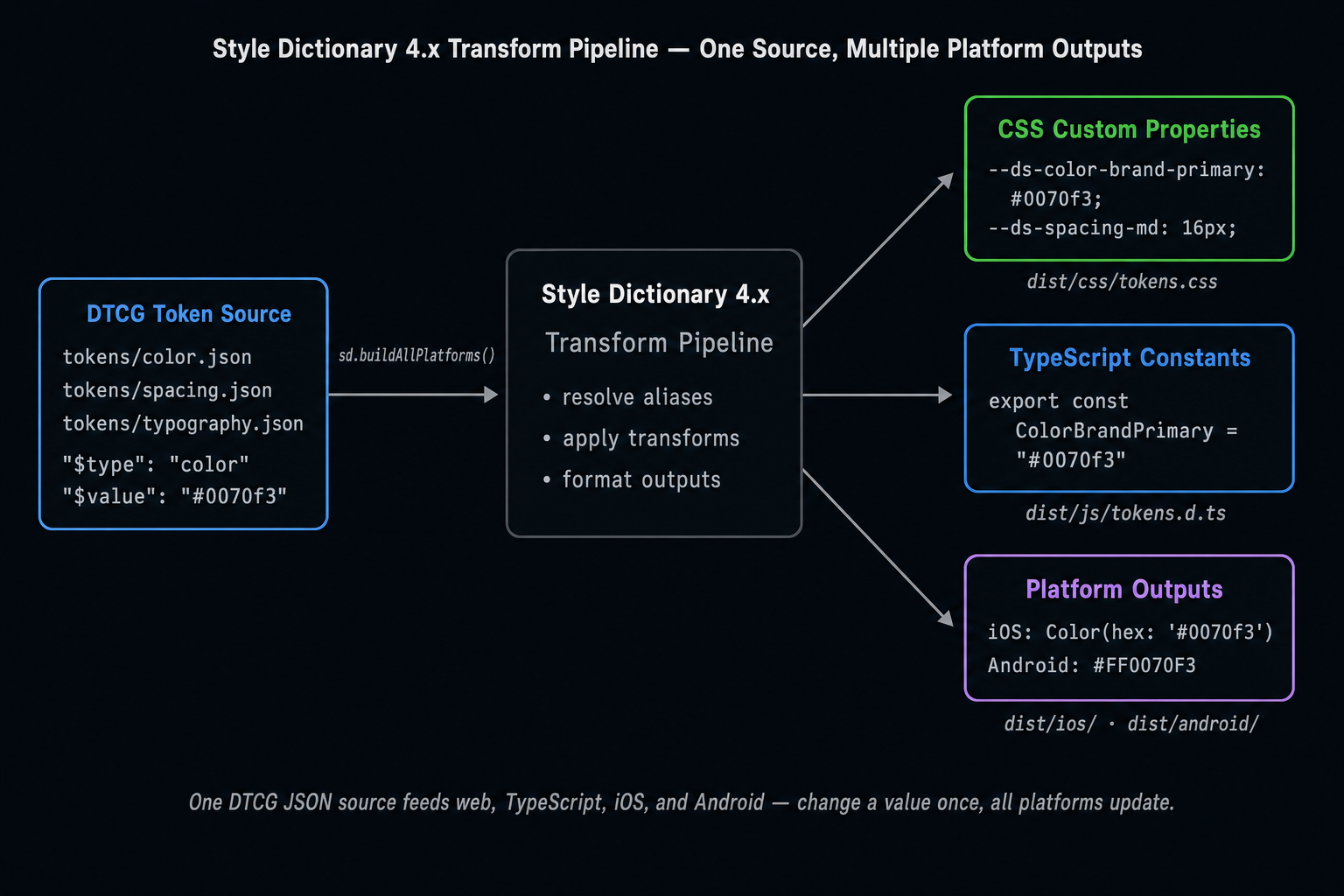
Style Dictionary transforms DTCG JSON source tokens into platform-specific outputs: CSS custom properties, TypeScript constants, iOS Swift Color extensions, Android XML resources.
4.1 Configuration
4.2 Generated Outputs
CSS custom properties (dist/css/tokens.css):
TypeScript constants (dist/js/tokens.d.ts):
4.3 Consuming Tokens in Application Code
CSS custom properties are the preferred token delivery mechanism for web applications. They are resolved at runtime by the browser, enabling theming through :root overrides and media query variations. TypeScript constants are for contexts where CSS variables cannot be used (Canvas APIs, third-party charting libraries, email templates).
5. Layer 2 — Headless Accessible Primitives
5.1 Why Headless Primitives Exist
Building an accessible Dialog, Combobox, or DatePicker from scratch requires implementing:
- ARIA roles, attributes, and live regions.
- Keyboard navigation (focus trapping, arrow key traversal, Escape to close).
- Screen reader announcements.
- RTL (right-to-left) layout support.
- Mobile touch event handling.
This is weeks of work per component, per team. The answer is to share the accessibility logic while keeping the visual presentation entirely local to each team.
5.2 Headless Libraries in 2026
| Library | Maintained By | Approach | Best For |
|---|---|---|---|
| Radix UI | WorkOS | Unstyled React primitives with full a11y | React apps needing Tailwind or CSS Modules styling |
| React Aria | Adobe | Hook-based, platform-agnostic, WCAG 2.2 | Strict accessibility requirements |
| Base UI | MUI | Headless React, composable slots | Teams migrating from MUI |
| Ariakit | Diego Haz | Hook-based, flexible composition | Custom design systems |
5.3 Usage Pattern — Radix UI Dialog with Custom Styling
Radix handles all ARIA attributes, focus trapping, keyboard dismissal, and portal rendering. The team handles visual presentation entirely through CSS that references Layer 1 tokens.
The critical principle: packages/ui (Layer 2) imports from @company/tokens (Layer 1). It never imports from any app-level package. This is the boundary that @nx/enforce-module-boundaries enforces — UI libraries cannot depend on apps.
6. Layer 3 — Composite Domain Components
6.1 What Belongs in Layer 3
Layer 3 components encode business-domain concepts. They are not generic UI patterns — they are specific implementations for a product area:
CheckoutSummary uses usePromoCode and useTaxRate — hooks that contain business logic specific to the checkout domain. Placing this in packages/ui forces every team that uses the shared UI library to carry checkout business logic in their bundle.
6.2 The Rule
Layer 3 components are never published as shared packages. They live in apps/checkout/src/ or packages/checkout-components/ with a scope tag that prevents any other domain from importing them. The design system team does not own Layer 3 — the product team does.
7. CSS Custom Property Scoping & Shadow DOM Boundaries
7.1 The Inheritance Problem
CSS custom properties inherit through the DOM tree. A token defined on :root is available to all descendants. This is the mechanism that makes theming work.
The problem arises at Shadow DOM boundaries. Custom elements that use Shadow DOM (Web Components) do not inherit CSS custom properties from the document root by default — the shadow tree has its own cascade root.
7.2 The Fix: Explicit Token Forwarding
For components that render inside Shadow DOM, tokens must be forwarded explicitly:
Or in the component's shadow root stylesheet:
Most React application teams do not use Shadow DOM — this is primarily a concern for Web Component-based micro-frontends or Angular Elements. If your design system targets React applications only, CSS custom properties work reliably without any forwarding configuration.
Summary
| Concept | Rule |
|---|---|
| Token format | Use W3C DTCG ($type, $value) — never a proprietary JSON schema |
| Token tiers | Primitive tokens hold raw values; semantic tokens alias primitives and carry meaning |
| Headless primitives | Own accessibility logic and keyboard behavior; never own visual presentation |
| Layer 3 rule | Domain components are never shared cross-domain — they live in the owning app or domain package |
| CSS custom properties | The correct web token delivery mechanism; use TypeScript constants only for non-CSS contexts |
| Shadow DOM | CSS custom properties do not cross Shadow DOM boundaries without explicit forwarding |
What's Next
In Part 4, we take the 3-layer architecture from this article and solve the hardest operational challenge: how to distribute tokens and components across independently deployed apps — evaluating static NPM packages, Module Federation runtime remotes, and the hybrid topology that is the production standard.
This article was developed with AI-assisted deep search, specification cross-referencing, and technical research synthesis.